#开发指南(iframe 渲染模式)
#渲染
举例说明:
#世界书
<Blanc>
时间:11:00
地点:酒店咖啡厅
服饰:白色衬衫领口系着精致的领结,搭配红色西装外套
动作:优雅的端起银质奶壶,缓缓倾倒入散发着香气的红茶里
</Blanc>#正则表达式
<Blanc>\s*时间:(.+?)\n\s*地点:(.+?)\n\s*服饰:(.+?)\n\s*动作:(.+?)\s*</Blanc>#替换为
```html
<!DOCTYPE html>
<html lang="zh-CN">
  <head>
    <meta charset="UTF-8" />
    <meta name="viewport" content="width=device-width, initial-scale=1.0" />
    <title>幕间记录 - Blanc</title>
    <script src="https://cdn.tailwindcss.com"></script>
    <style>
      @import url("https://fonts.googleapis.com/css2?family=Cinzel:wght@400;600&family=Noto+Serif+SC:wght@400;600&display=swap");

      body {
        font-family: "Noto Serif SC", serif;
        background: linear-gradient(135deg, #2c1810 0%, #4a3228 100%);
      }

      .paper {
        background: linear-gradient(to bottom, #f4e8d0 0%, #e8dcc4 100%);
        box-shadow: 0 20px 60px rgba(0, 0, 0, 0.5), inset 0 1px 0 rgba(255, 255, 255, 0.3);
        position: relative;
      }

      .paper::before {
        content: "";
        position: absolute;
        top: 0;
        left: 0;
        right: 0;
        bottom: 0;
        background-image: repeating-linear-gradient(
          transparent,
          transparent 31px,
          rgba(139, 115, 85, 0.1) 31px,
          rgba(139, 115, 85, 0.1) 32px
        );
        pointer-events: none;
      }

      .wax-seal {
        width: 80px;
        height: 80px;
        background: radial-gradient(circle, #8b0000 0%, #5c0000 100%);
        border-radius: 50%;
        box-shadow: 0 4px 8px rgba(0, 0, 0, 0.4), inset 0 -2px 4px rgba(0, 0, 0, 0.3);
        position: relative;
        animation: sealFloat 3s ease-in-out infinite;
      }

      .wax-seal::after {
        content: "B";
        position: absolute;
        top: 50%;
        left: 50%;
        transform: translate(-50%, -50%);
        font-family: "Cinzel", serif;
        font-size: 32px;
        font-weight: 600;
        color: rgba(244, 232, 208, 0.8);
        text-shadow: 0 1px 2px rgba(0, 0, 0, 0.5);
      }

      @keyframes sealFloat {
        0%,
        100% {
          transform: translateY(0px);
        }
        50% {
          transform: translateY(-5px);
        }
      }

      .ink-text {
        color: #2c1810;
        text-shadow: 0 1px 1px rgba(44, 24, 16, 0.1);
      }

      .divider {
        height: 2px;
        background: linear-gradient(
          to right,
          transparent,
          #8b7355,
          transparent
        );
        margin: 20px 0;
      }

      .corner-decoration {
        position: absolute;
        width: 40px;
        height: 40px;
        border: 2px solid rgba(139, 115, 85, 0.3);
      }

      .corner-tl {
        top: 20px;
        left: 20px;
        border-right: none;
        border-bottom: none;
      }
      .corner-tr {
        top: 20px;
        right: 20px;
        border-left: none;
        border-bottom: none;
      }
      .corner-bl {
        bottom: 20px;
        left: 20px;
        border-right: none;
        border-top: none;
      }
      .corner-br {
        bottom: 20px;
        right: 20px;
        border-left: none;
        border-top: none;
      }

      .field-label {
        font-family: "Cinzel", serif;
        font-size: 12px;
        letter-spacing: 2px;
        color: #8b7355;
        text-transform: uppercase;
      }

      .field-value {
        font-size: 18px;
        line-height: 1.8;
        margin-top: 4px;
      }

      .fade-in {
        animation: fadeIn 1s ease-out;
      }

      @keyframes fadeIn {
        from {
          opacity: 0;
          transform: translateY(20px);
        }
        to {
          opacity: 1;
          transform: translateY(0);
        }
      }
    </style>
  </head>
  <body class="min-h-screen flex items-center justify-center p-4">
    <div
      class="paper max-w-md w-full rounded-sm p-8 fade-in"
      style="min-height: 600px;"
    >
      <div class="corner-decoration corner-tl"></div>
      <div class="corner-decoration corner-tr"></div>
      <div class="corner-decoration corner-bl"></div>
      <div class="corner-decoration corner-br"></div>

      <div class="flex justify-center mb-6">
        <div class="wax-seal"></div>
      </div>

      <h1
        class="text-center ink-text text-2xl mb-6"
        style="font-family: 'Cinzel', serif; letter-spacing: 3px;"
      >
        幕间记录
      </h1>

      <div class="divider"></div>

      <div class="space-y-6 mt-8">
        <div class="fade-in" style="animation-delay: 0.2s;">
          <div class="field-label">时刻 · Time</div>
          <div class="field-value ink-text">$1</div>
        </div>

        <div class="fade-in" style="animation-delay: 0.4s;">
          <div class="field-label">地点 · Location</div>
          <div class="field-value ink-text">$2</div>
        </div>

        <div class="fade-in" style="animation-delay: 0.6s;">
          <div class="field-label">服饰 · Attire</div>
          <div class="field-value ink-text">$3</div>
        </div>

        <div class="fade-in" style="animation-delay: 0.8s;">
          <div class="field-label">动作 · Action</div>
          <div class="field-value ink-text">$4</div>
        </div>
      </div>

      <div class="divider mt-8"></div>

      <div
        class="text-center mt-6 ink-text opacity-50"
        style="font-family: 'Cinzel', serif; font-size: 10px; letter-spacing: 2px;"
      >
        INTERMISSION · BLANC
      </div>
    </div>
  </body>
</html>
```
</details>

### 处理结果


正则替换后的HTML

<details>
```html
<!DOCTYPE html>
<html lang="zh-CN">
  <head>
    <meta charset="UTF-8" />
    <meta name="viewport" content="width=device-width, initial-scale=1.0" />
    <title>幕间记录 - Blanc</title>
    <script src="https://cdn.tailwindcss.com"></script>
    <style>
      @import url("https://fonts.googleapis.com/css2?family=Cinzel:wght@400;600&family=Noto+Serif+SC:wght@400;600&display=swap");

      body {
        font-family: "Noto Serif SC", serif;
        background: linear-gradient(135deg, #2c1810 0%, #4a3228 100%);
      }

      .paper {
        background: linear-gradient(to bottom, #f4e8d0 0%, #e8dcc4 100%);
        box-shadow: 0 20px 60px rgba(0, 0, 0, 0.5), inset 0 1px 0 rgba(255, 255, 255, 0.3);
        position: relative;
      }

      .paper::before {
        content: "";
        position: absolute;
        top: 0;
        left: 0;
        right: 0;
        bottom: 0;
        background-image: repeating-linear-gradient(
          transparent,
          transparent 31px,
          rgba(139, 115, 85, 0.1) 31px,
          rgba(139, 115, 85, 0.1) 32px
        );
        pointer-events: none;
      }

      .wax-seal {
        width: 80px;
        height: 80px;
        background: radial-gradient(circle, #8b0000 0%, #5c0000 100%);
        border-radius: 50%;
        box-shadow: 0 4px 8px rgba(0, 0, 0, 0.4), inset 0 -2px 4px rgba(0, 0, 0, 0.3);
        position: relative;
        animation: sealFloat 3s ease-in-out infinite;
      }

      .wax-seal::after {
        content: "B";
        position: absolute;
        top: 50%;
        left: 50%;
        transform: translate(-50%, -50%);
        font-family: "Cinzel", serif;
        font-size: 32px;
        font-weight: 600;
        color: rgba(244, 232, 208, 0.8);
        text-shadow: 0 1px 2px rgba(0, 0, 0, 0.5);
      }

      @keyframes sealFloat {
        0%,
        100% {
          transform: translateY(0px);
        }
        50% {
          transform: translateY(-5px);
        }
      }

      .ink-text {
        color: #2c1810;
        text-shadow: 0 1px 1px rgba(44, 24, 16, 0.1);
      }

      .divider {
        height: 2px;
        background: linear-gradient(
          to right,
          transparent,
          #8b7355,
          transparent
        );
        margin: 20px 0;
      }

      .corner-decoration {
        position: absolute;
        width: 40px;
        height: 40px;
        border: 2px solid rgba(139, 115, 85, 0.3);
      }

      .corner-tl {
        top: 20px;
        left: 20px;
        border-right: none;
        border-bottom: none;
      }
      .corner-tr {
        top: 20px;
        right: 20px;
        border-left: none;
        border-bottom: none;
      }
      .corner-bl {
        bottom: 20px;
        left: 20px;
        border-right: none;
        border-top: none;
      }
      .corner-br {
        bottom: 20px;
        right: 20px;
        border-left: none;
        border-top: none;
      }

      .field-label {
        font-family: "Cinzel", serif;
        font-size: 12px;
        letter-spacing: 2px;
        color: #8b7355;
        text-transform: uppercase;
      }

      .field-value {
        font-size: 18px;
        line-height: 1.8;
        margin-top: 4px;
      }

      .fade-in {
        animation: fadeIn 1s ease-out;
      }

      @keyframes fadeIn {
        from {
          opacity: 0;
          transform: translateY(20px);
        }
        to {
          opacity: 1;
          transform: translateY(0);
        }
      }
    </style>
  </head>
  <body class="min-h-screen flex items-center justify-center p-4">
    <div
      class="paper max-w-md w-full rounded-sm p-8 fade-in"
      style="min-height: 600px;"
    >
      <div class="corner-decoration corner-tl"></div>
      <div class="corner-decoration corner-tr"></div>
      <div class="corner-decoration corner-bl"></div>
      <div class="corner-decoration corner-br"></div>

      <div class="flex justify-center mb-6">
        <div class="wax-seal"></div>
      </div>

      <h1
        class="text-center ink-text text-2xl mb-6"
        style="font-family: 'Cinzel', serif; letter-spacing: 3px;"
      >
        幕间记录
      </h1>

      <div class="divider"></div>

      <div class="space-y-6 mt-8">
        <div class="fade-in" style="animation-delay: 0.2s;">
          <div class="field-label">时刻 · Time</div>
          <div class="field-value ink-text">11:00</div>
        </div>

        <div class="fade-in" style="animation-delay: 0.4s;">
          <div class="field-label">地点 · Location</div>
          <div class="field-value ink-text">酒店咖啡厅</div>
        </div>

        <div class="fade-in" style="animation-delay: 0.6s;">
          <div class="field-label">服饰 · Attire</div>
          <div class="field-value ink-text">
            白色衬衫领口系着精致的领结,搭配红色西装外套
          </div>
        </div>

        <div class="fade-in" style="animation-delay: 0.8s;">
          <div class="field-label">动作 · Action</div>
          <div class="field-value ink-text">
            优雅的端起银质奶壶,缓缓倾倒入散发着香气的红茶里
          </div>
        </div>
      </div>

      <div class="divider mt-8"></div>

      <div
        class="text-center mt-6 ink-text opacity-50"
        style="font-family: 'Cinzel', serif; font-size: 10px; letter-spacing: 2px;"
      >
        INTERMISSION · BLANC
      </div>
    </div>
  </body>
</html>
```
最终效果预览
#API:调用平台能力
我们将提供一个全局对象 window.$mujian,创作者可以通过这个对象来和平台交互。
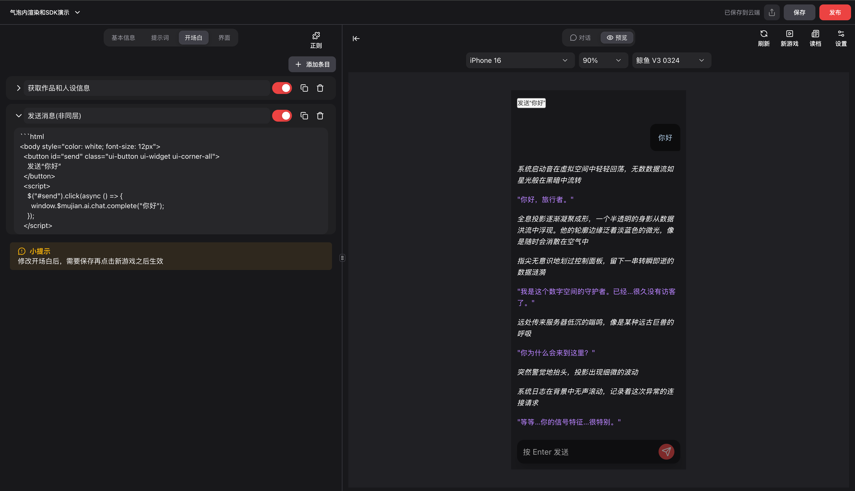
#发送消息(非同层)
window.$mujian.ai.chat.complete("你要发送的消息内容");完整代码:
```html
<body style="color: white; font-size: 12px">
  <button id="send" class="ui-button ui-widget ui-corner-all">
    发送“你好”
  </button>
  <script>
    $("#send").click(async () => {
      window.$mujian.ai.chat.complete("你好"); // 发送消息
    });
  </script>
</body>
```
#获取当前作品信息
window.$mujian.ai.chat.project完整代码:
```html
<body style="color: white; font-size: 12px; border:1px solid green">
  <div>作品信息:</div>
  <div id="project">-</div>

  <div>人设信息:</div>
  <div id="persona">-</div>

  <script>
    $("#project").text(JSON.stringify(window.$mujian.ai.chat.project)); // 获取作品信息
    $("#persona").text(JSON.stringify(window.$mujian.ai.chat.settings.persona)); // 获取人设信息
  </script>
</body>
```
#获取当前人设信息
window.$mujian.ai.chat.settings.persona完整代码:
```html
<body style="color: white; font-size: 12px; border:1px solid green">
  <div>作品信息:</div>
  <div id="project">-</div>

  <div>人设信息:</div>
  <div id="persona">-</div>

  <script>
    $("#project").text(JSON.stringify(window.$mujian.ai.chat.project)); // 获取作品信息
    $("#persona").text(JSON.stringify(window.$mujian.ai.chat.settings.persona)); // 获取人设信息
  </script>
</body>
```
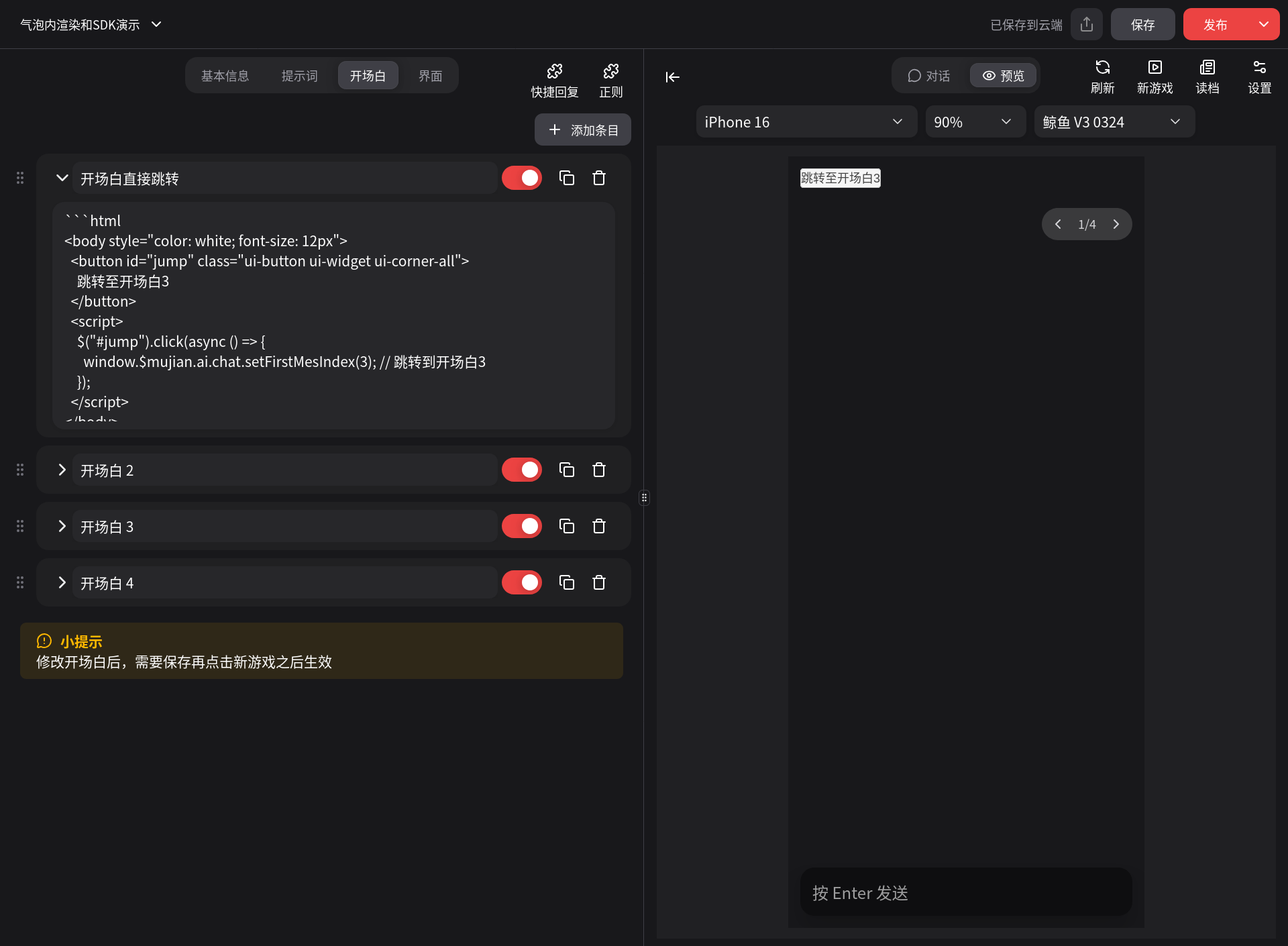
#开场白直接跳转
将你想要跳转到的开场白编号填入下方括号中,编号从1开始,开场白1就是用户进来看到的那一条开场白。 如果填入了不存在的开场白编号,则什么也不会发生。
window.$mujian.ai.chat.setFirstMesIndex(3); // 跳转到开场白3完整代码:
```html
<body style="color: white; font-size: 12px">
  <button id="jump" class="ui-button ui-widget ui-corner-all">
    跳转至开场白3
  </button>
  <script>
    $("#jump").click(async () => {
      window.$mujian.ai.chat.setFirstMesIndex(3); // 跳转到开场白3
    });
  </script>
</body>
```
点击按钮会直接跳转到开场白3
#三方库支持
我们在iframe渲染模式下,默认支持以下受信任的三方库:
fontawesome-free: 图标库tailwindcss: 样式库jquery: 库jquery-ui: UI库jquery-ui-touch-punch: 触摸事件库
创作者如果想添加更多的库,可以与我们联系,我们将根据实际情况进行评估。
#变量方案
筹备中...
#限制
为了保障创作者的作品符合安全标准,我们限制了以下行为:
- 引入三方库
如果需要引入,请与我们联系。
- 外部 worker 线程
- 发起 fetch 网络请求
- 嵌套外部 iframe
幕间保留根据实际情况随时调整限制的权利。